

In the summer of 2025, I built and shipped a new landing page for Magic Hour, an AI video and image generation platform. In the first month after launch, the site's signup conversion rose about 12%.
- Team: me and a designer
- Stack: Next.js, TypeScript, Tailwind
The goal
The aim was a home page that looked presentable and trustworthy, as well as one that turned more visitors into signups and, ideally, paying users.
Before
The old page, as of March 2025, was pretty repetitive and bland. Every section was centered and built the same way: a heading, one line of text, and then content. Nine buttons shared the same solid purple, from the hero all the way to the six Learn More buttons, so there was no differentiating factor that told you which one mattered. Furthermore, nine videos were set to autoplay as soon as the page loaded; I'll dive into why this was so detrimental later.
What I owned
The designer handed me a full Figma file covering desktop and phone, and the copy came from the team. My job was building it: turning the designs into code, and deciding the things a static design leaves open.
- Hover states. The designs didn't specify all of them, so I picked treatments that kept good contrast.
- The tool carousel's speed. Slow enough to take in each tool, but not so slow that getting through all of them felt endless.
- Phone layouts. Most of the responsive work was layout and sizing within each section, following the phone frames.
Videos that only play on screen
The new page has a lot of videos, roughly 64MB worth. During pre-launch inspection, this had posed a very dire problem: on mobile, the landing page would crash the browser 9/10 times when you would try to scroll through it within the first few seconds. So, you may be wondering, how would you remedy this undesirable side effect? Well, that would be thanks to the IntersectionObserver API.
TLDR: The IntersectionObserver API allows you to detect when an element
enters or leaves the viewport. If you're interested, you can learn more about
the API
here.
The codebase had an existing useOnScreen hook that was powered by the IntersectionObserver API. Here's a rough implementation of the hook:
import { useEffect, useState, type RefObject } from "react";

export function useOnScreen(ref: RefObject<Element | null>, threshold = 0.5) {
  const [isVisible, setIsVisible] = useState(false);

  useEffect(() => {
    const element = ref.current;

    if (!element) return;

    const observer = new IntersectionObserver(
      ([entry]) => {
        setIsVisible(entry.isIntersecting);
      },
      { threshold }
    );

    observer.observe(element);

    return () => observer.disconnect();
  }, [ref, threshold]);

  return isVisible;
}
After discovering this hook thanks to a tip from our CTO—thanks again, David!—I went out of my way to build a reusable video component that only plays when it is on screen.
Additional context: With the introduction of this new component, I was also able to swap out every video across the entire site, leading to a great overall performance win!
The heavier sections relied on IntersectionObserver too: they were dynamically imported once they neared the viewport, so their code didn't all load at once on the first visit.
The developers section
Most of the landing page was made up of new, original sections, but a few parts reused components that already existed on other pages.
The developers section was one of them. It shows a code snippet for API users, and Magic Hour's /api page already had a working code preview, so I kept its core logic and restyled it to match the new designs.
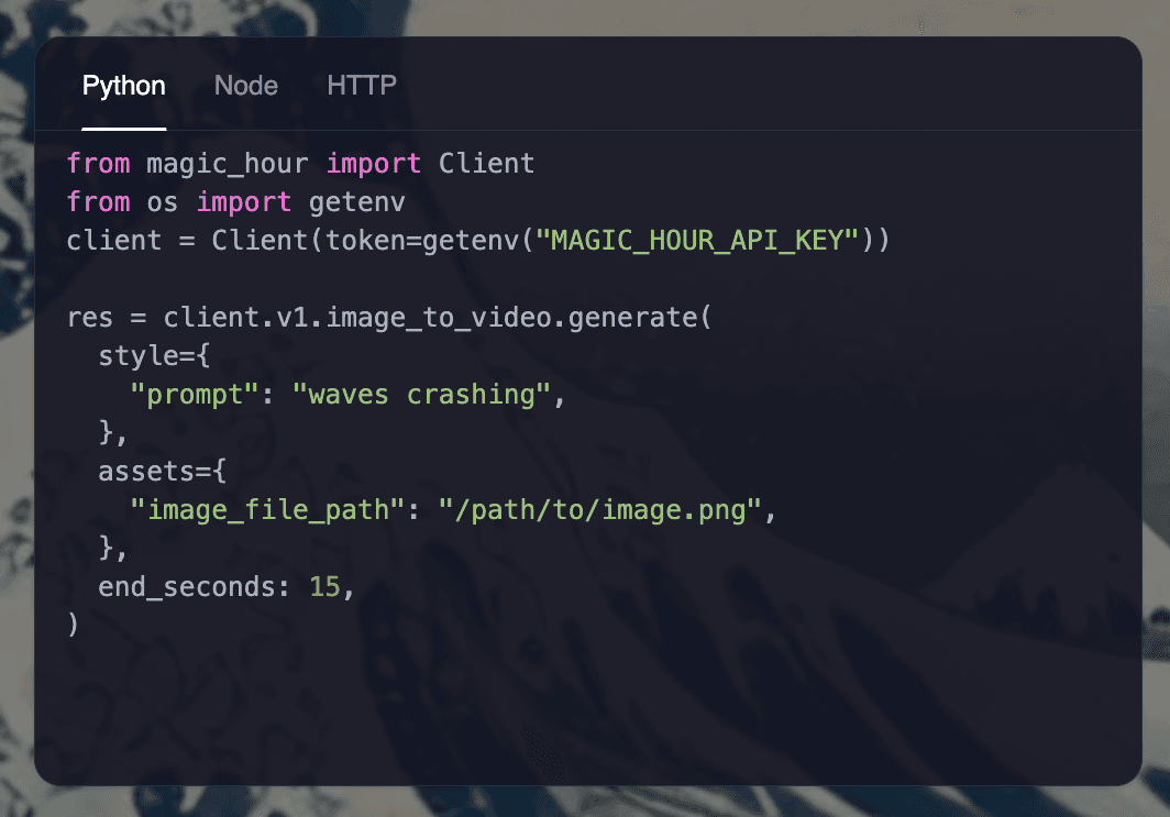
/api page.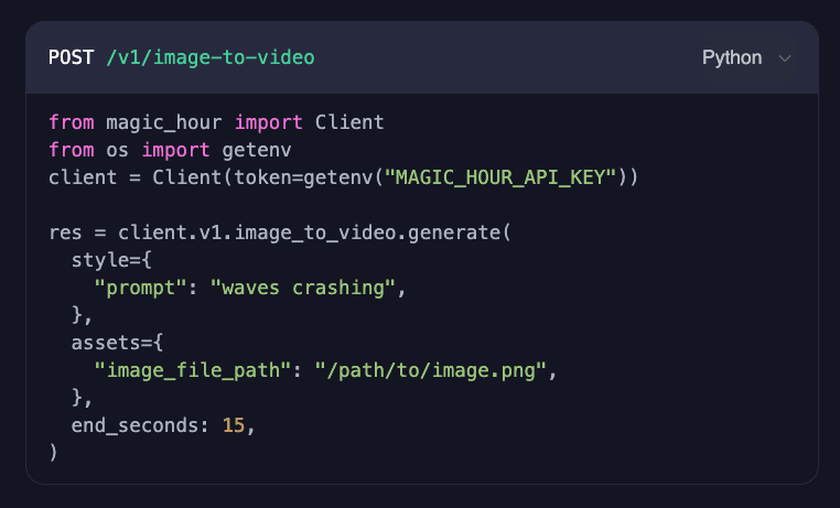
After
The new page, as of September 2025. It has since been replaced, so this recording is the best record of it.
The accessibility pass
A few weeks after launch, I went back for an accessibility pass: text contrast, the right roles on elements, and a semantic HTML order that made sense.
One example is the hero's supporting line, under the headline. It was too dim and blended into the background. I changed it to white at 60% opacity, which raised its contrast from 5.6:1 to 7.3:1.


What I'd do differently
Since then, I've learned a lot more about accessibility and how to make the web a better experience for everyone. If I were to do this project again, here's a few additional changes I'd make:
- Respect reduced motion. At the time I didn't know
prefers-reduced-motionexisted, so carousels that are on the page kept moving for everyone. Now, I'd stop it entirely for people who ask for less motion. - Let people pause the carousels. Carousels on the page currently move on their own and can't be stopped. WCAG's Pause, Stop, Hide asks for a way to pause content like that.