Context
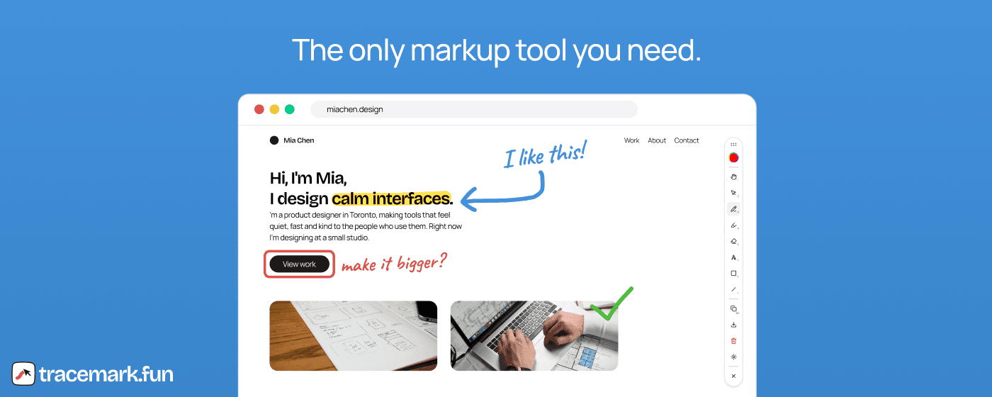
Tracemark is a Chrome extension that lets you annotate/markup any website and copy the results to your clipboard or export them as an image.
Problem
Background
My friend, Arman, likes to annotate website UIs. He uses those annotations as an effective way of providing context for his coding agents; that way, he can make changes/adjustments to the UI to his liking.
His current flow:
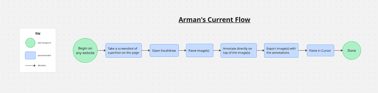
Although this might seem like a straightforward process, there is actually a ton of friction behind the scenes, with most of it spanning the process of screenshotting a portion of the UI and annotating it in Excalidraw. Frequently repeating this chunk of the flow over and over again to accomplish his objective eventually got repetitive and tiring.
The Opportunity
Back in January 2026, I posted on X asking for project ideas because I had no idea what to work on after wrapping up a previous side project.
Arman commented a link on my post that referred to one of his other posts, where he described the friction he had with his aforementioned process of annotating web UI.
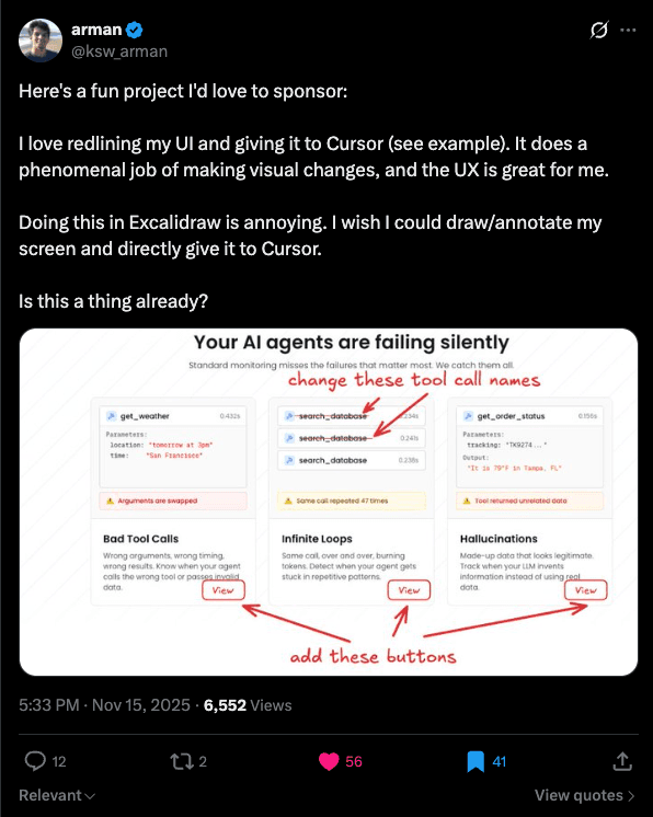
So I decided to pursue this project (for free, since it just sounded fun) because I thought it'd be pretty cool to solve a problem I had zero background or context in at the time; it seemed like a good challenge!
Research
After I told Arman I was down to pursue the project, he initially pitched the idea of making it a Chrome extension. But before I dug into design and development, I figured it made sense to conduct some competitive analysis first. I looked into existing Chrome extensions that, more or less, solved Arman's inefficient annotation workflow.
- Page Marker is by far the most popular and widely used extension that accomplished what I envisioned. It's an all-in-one extension that injects a toolbar full of annotation tools, including text, frames, pencils, and more.
- Web Paint Tool was the second most popular, and it essentially did everything that Page Marker did as well.
You might be wondering: if there were already such tools, why bother reinventing the wheel? The answer has 2 halves: UI and UX.
The UI was alright, but could've been much better
Both extensions got the job done, but the toolbar UI felt way too clunky and awkward to navigate. They consisted of either multiple long columns or rows of different types of tools/controls, and it felt like multiple elements were competing for attention.
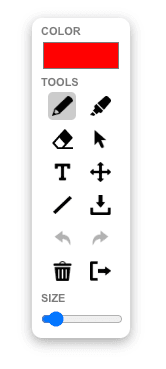
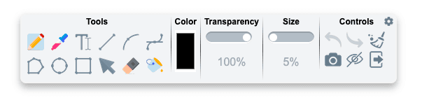
Also, frankly speaking, these toolbars didn't look very visually appealing and seemed pretty outdated by today's standards for modern UI. Among the issues were inconsistent spacing, unclear iconography, and poor visual hierarchy.
The UX vastly needed improvement
I wasn't a big fan of the toolbars spanning more than one centralized row/column, as it required the user to scan across multiple rows/columns, adding unnecessary friction instead of maintaining a single, clear focal point.
Furthermore, other aspects of both extensions didn't logically make sense:
- Both extensions included shortcuts, but they weren't visible on each tool, forcing users to memorize them.
- Both extensions had vague sizing controls: Page Marker's size slider had no numerical or visual representation, so users had to guess their intended size through trial and error. Web Paint Tool uses a percentage to determine size, but this is extremely vague, and nothing can be deduced from using a percentage when a user is unsure of the numerical baseline unit.
- Both extensions didn't return to a "Select" tool for certain objects: Using Figma and Excalidraw as a reference, for tools like shapes, text, or lines/arrows, after letting go of your cursor and creating the final shape, the tool immediately selects the object you just created. This way, you can immediately adjust the object, whether it's its position, size, or anything else you might've missed/unintentionally did when initially creating it.
- Page Marker doesn't have an option to temporarily hide the extension from the page without completely removing it, which would remove all the user's annotations. A toggle button, or even a keybind, would be useful when the user wants to view the entire page UI again with nothing obstructing the view.
- Web Paint Tool doesn't have a "Select" tool for users to interact with annotated objects, for instance, to rescale or move them around (the importance of having this is as mentioned a few bullet points ago).
Design Decisions
With these findings, I had a clearer idea of the kind of extension I wanted to make. So I decided to hop into a Figma file and start prototyping ideas.
v1
Beginning in early January, I was referring to existing toolbar UIs such as the ones found on Figma / Excalidraw (since Arman was already familiar with this UI + I thought it looked pretty appealing) and came up with this:
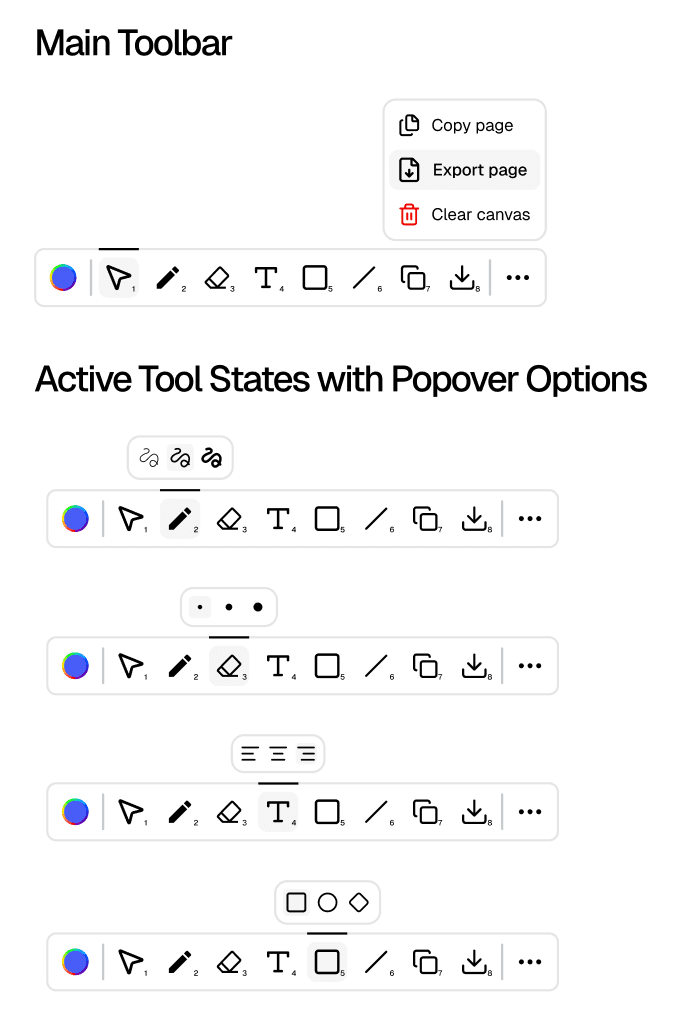
I decided to keep it a single, uniform row of tools/utilities; that way, there is a single clear focal point, and users only have to scan horizontally across one row. I also tackled the unclear sizing issue in the other tools by creating predefined stroke sizes for certain tools that use them, like the pencil and eraser. Doing it this way reduces the potential lack of clarity users might feel by giving them just a few options they would realistically need. These option icons are also made distinctive by using different stroke-weight sizes, which gives a good idea of the thickness or weight the actual tool would be.
I also wanted to add a few other features I noticed the other tools didn't have, such as additional frame-type options for the frame tool and a copy-to-clipboard button.
At the time, I thought this looked decent. But later on, I realized it could have been much, much better, which led me to the next version of Tracemark.
v2
I took a few months off to try other things, but eventually came back to Tracemark during the summer-fall period. During this time, I learned more about design systems and their importance within a product, so I figured I should establish a formal design system for Tracemark.
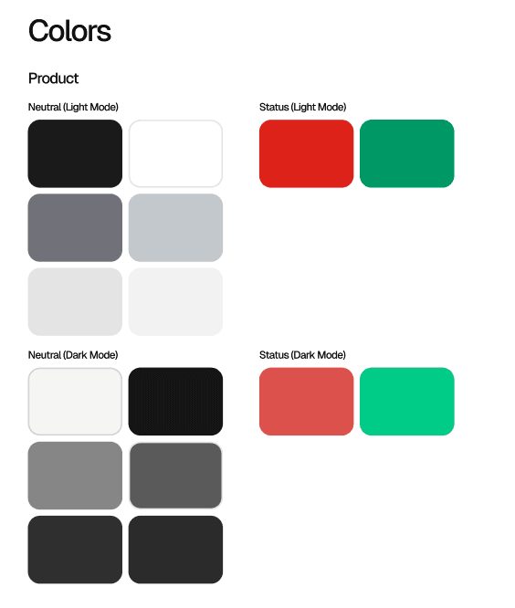
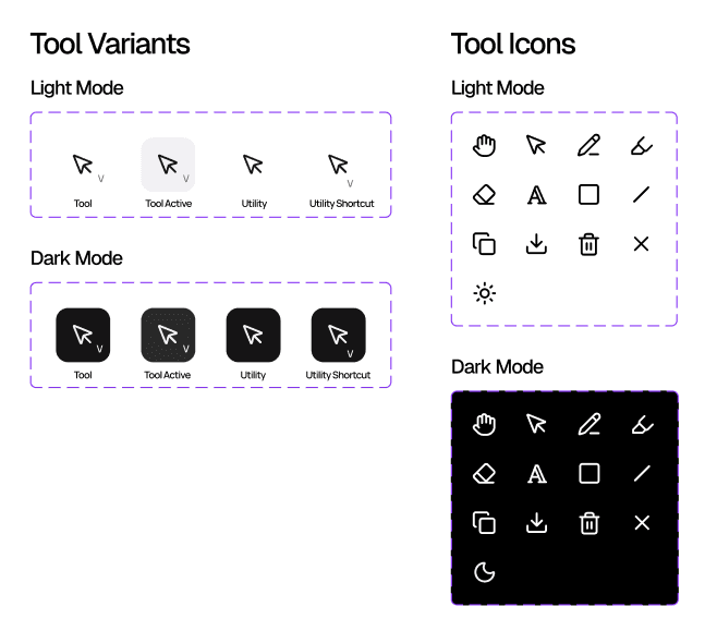
Now that I had a consistent design system to refer to, I iterated upon the v1 designs that I had for the toolbar and ended up with:
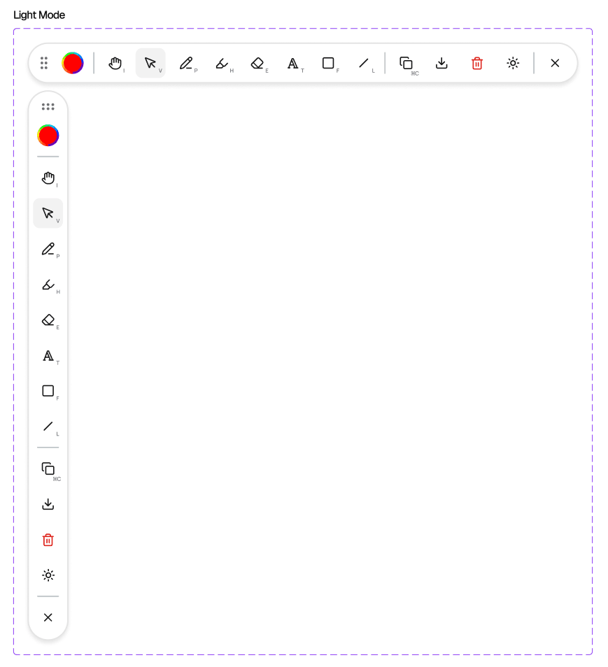
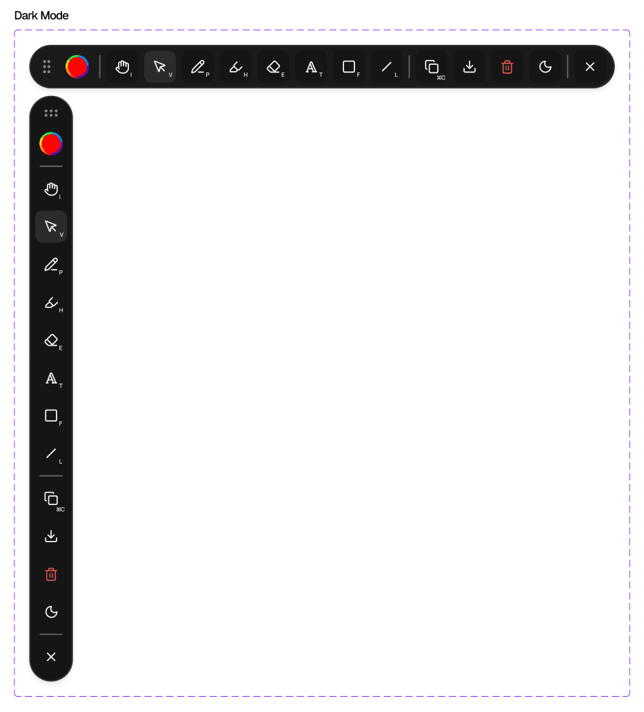
Most of the design is similar to v1 of Tracemark, with some changes. For instance, version 1 of Tracemark had an additional menu you could click to use secondary actions or utilities, such as clearing the canvas, exporting the whole page, or copying the whole page to your clipboard. After talking with Arman and getting his opinion on v1, I realized the full-page export/copy-to-clipboard options weren't very reliable because the image that would be downloaded/copied would be zoomed out so much that it was hard to see the annotations. So, I removed those full-page options and kept only the initial copy and export buttons for the annotations within the current viewport. I also decided to place the clear canvas utility action right next to those utilities, as a trash can icon, since it is a universally understood icon for destruction/removal.
Aside from cleaning up the secondary actions, I went back to my research findings and made sure v2 actually addressed the gaps I noticed in the other extensions, while keeping (and improving on) what they already got right:
Visible shortcuts
Every tool now has its shortcut letter displayed right on it (I for Interact, V for Select, P for Pencil, and so on). I swapped out the number shortcuts from v1 for letters, since letters are more intuitive and match what Figma and Excalidraw already use. Having the letter on the tool itself means you can see it on demand, rather than having to remember it.
Hiding the extension
You can now toggle the visibility of the toolbar and your annotations with ⌘. / Ctrl+., which hides everything without getting rid of your work. This was the option Page Marker was missing.
Interact tool
Both extensions already let you go back to the page underneath, in case you wanna copy some text or click something, but I felt my icon choice made more sense. I went with a hand, since it reads as reaching through to touch the page itself.
Highlighter tool
A translucent stroke for marking up text. I used this one as a reference from Page Marker, since it already had it, and it fits well with students using Tracemark to take notes.
Edge snapping
The toolbar can be dragged around, but it snaps to the edges of the screen (horizontal on the top and bottom, vertical on the left and right). You can still drag it to a custom spot along an edge, just not anywhere else. The main focal point of most websites is essentially the center of the screen, so keeping the toolbar on the edges means it never obstructs what you're actually looking at. Technically nobody complained about this, but I figured snapping was better UX, and it just felt better to use.
Theme toggle
Depending on whether the site you were on was light or dark, the toolbar could be pretty hard to see, so I added a light/dark theme toggle to account for both (it follows your system by default). This also takes user preference into account, and neither of the two leading extensions had it.
Close button
Both extensions already had a way to close the toolbar, but I made it more intuitive by using an X icon, since an X is what people usually read as closing something.
Visually, I rounded the toolbar into a pill and swapped the filled icons for outlined ones (including a custom Text icon). This way, everything follows the iconography in the design system, and I replaced the black bar above the active tool with a simple background fill.
Branding
When I first tackled v1, I didn't really consider product identity or branding. My focus was on the toolbar itself, which is why the first iteration looked pretty lackluster for both the product and the landing page.
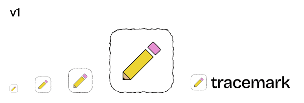
v1
For the logo, I went with a pencil that I created as a vector in Figma. Going into this months ago, I figured a pencil was a smart choice since drawing was part of the extension.
v2
For v2, I started by actually defining what Tracemark is as a product before designing anything else:
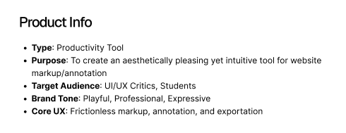
The target audience started as UI/UX critics and students. Later, I added developers after realizing they could also use Tracemark to iterate with their coding agents, similar to how Arman does.
Typography
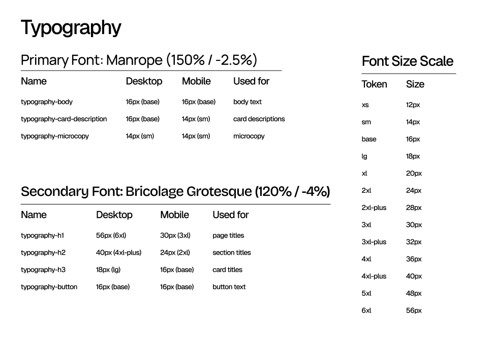
I wanted fonts that were a mix of professional, playful, and expressive. I ended up with Bricolage Grotesque for headings and the wordmark, since I thought it perfectly mixed all three, and Manrope for body text, since it's refined, modern, and professional.
Colors
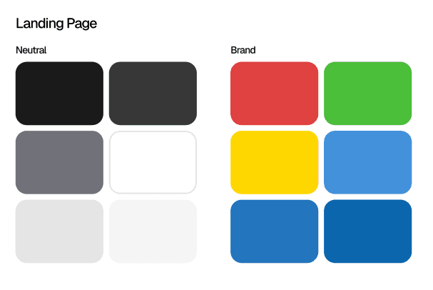
For the landing page, I paired a neutral scale with six brand colors: red, green, yellow, and three shades of blue.
Spacing
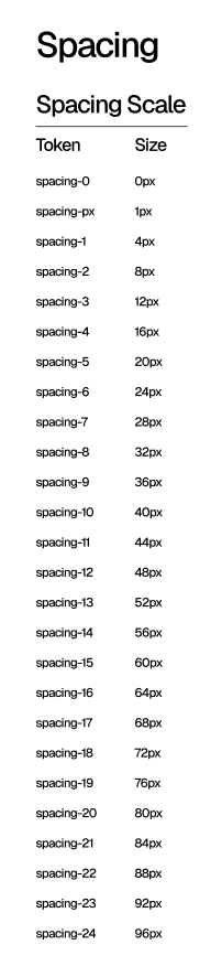
I also set up a spacing scale on a 4px grid, running from 0 to 96px, plus a 1px step.
The logo
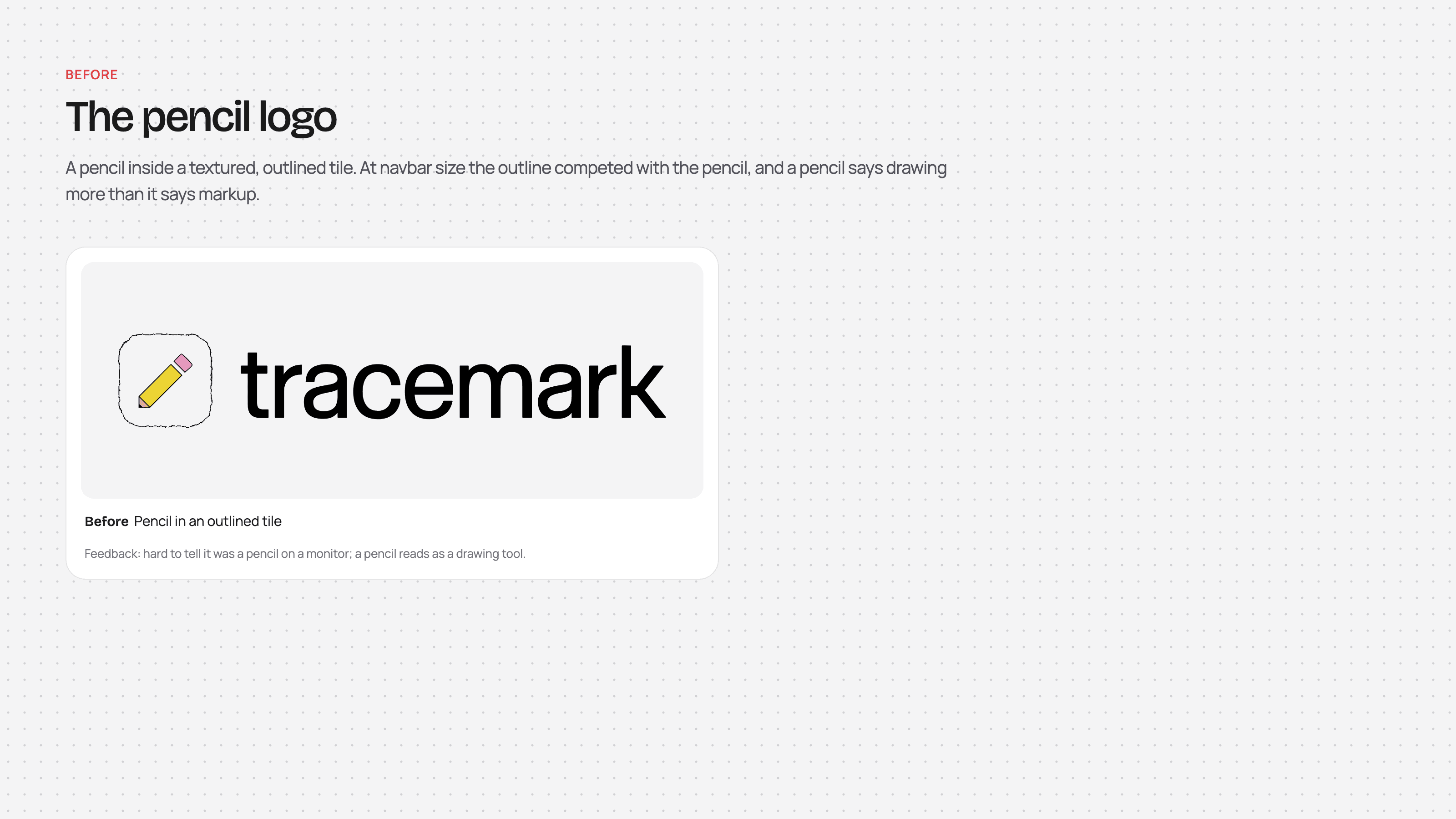
With the brand defined, I soon realized that the pencil logo didn't really fit. The point of the extension is annotation/markup, not drawing, and user feedback backed this up: the pencil read as a drawing tool, and it was hard to make out at small sizes like in a navbar.
So I went back to the drawing board and iterated with Claude over six rounds, picking the strongest directions each round and pushing them further. Here's the whole journey at a glance:
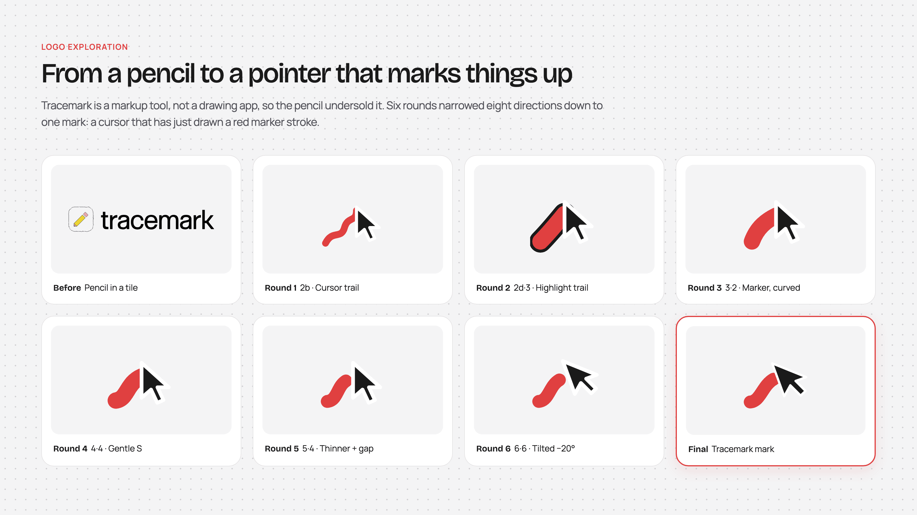
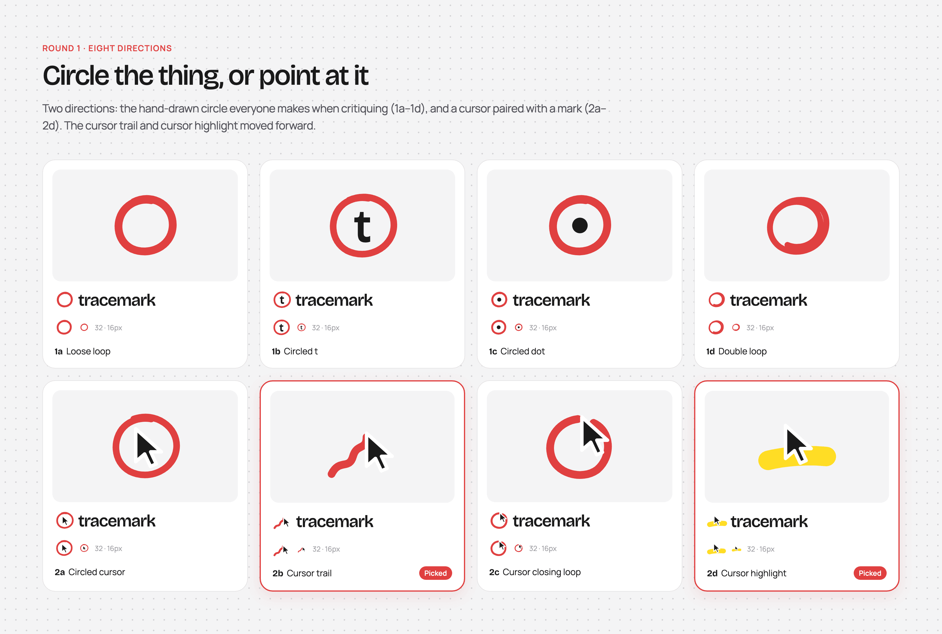
Round 1: I started broad with eight directions: either circling the thing, like you would when critiquing something, or pointing at it with a cursor. The cursor trail and cursor highlight felt the most like Tracemark, so those two moved forward.
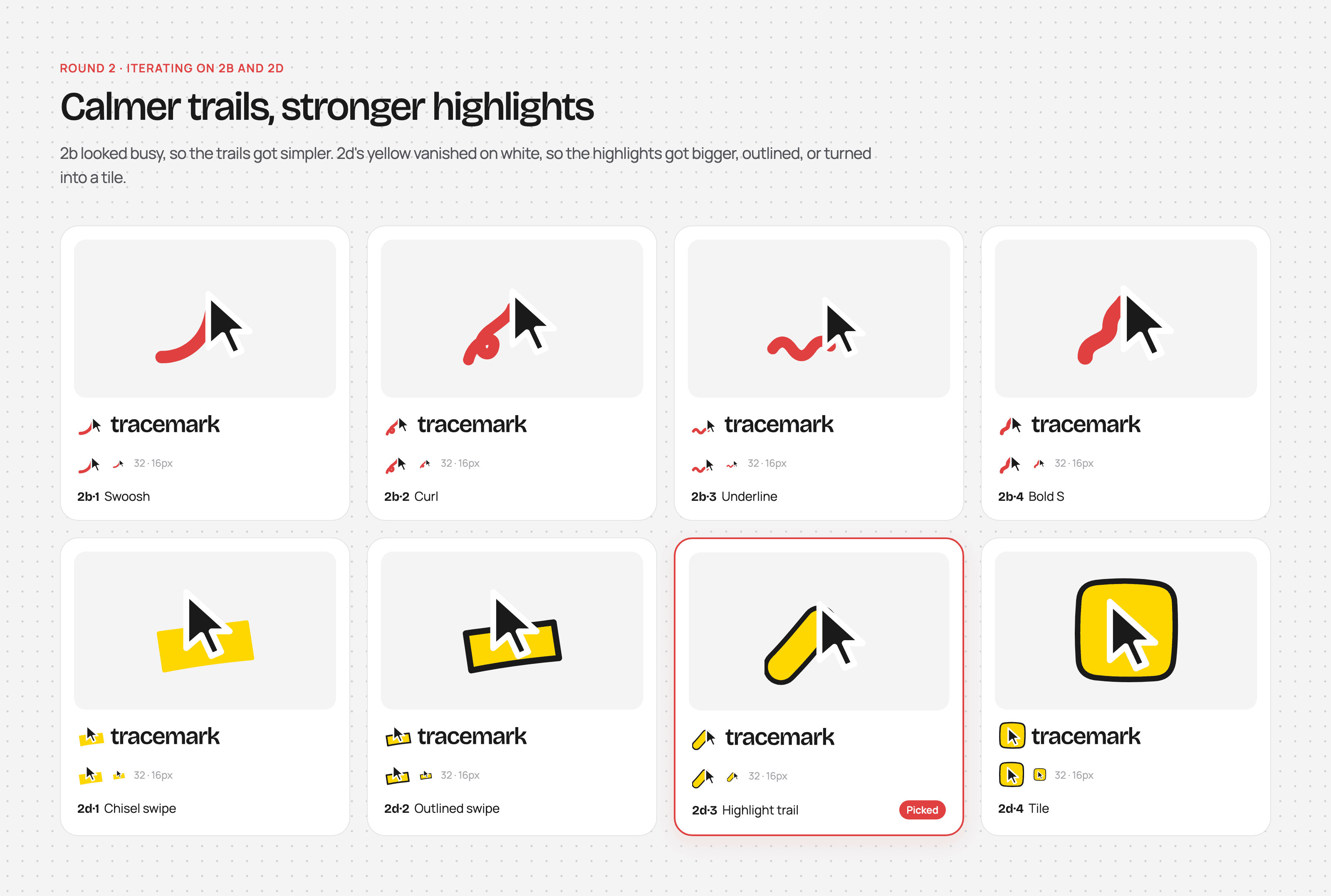
Round 2: The trails were looking a bit busy, so I simplified them. The yellow highlights also kept vanishing on white backgrounds, so I tried making them bigger, outlining them, or turning them into a tile.
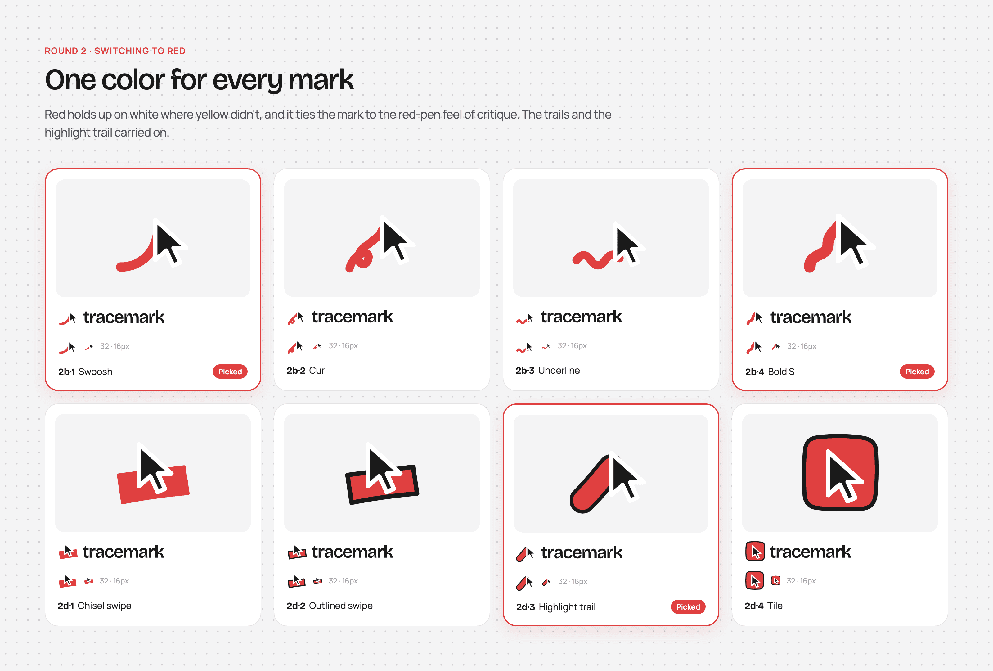
Yellow still wasn't holding up, so I switched every mark to red. Red is the go-to color for markup, the same red you'd see on a graded paper at school, which fits since I'm marketing Tracemark towards students as well. Page Marker also uses red for its icon, and that already seemed to do well for them.
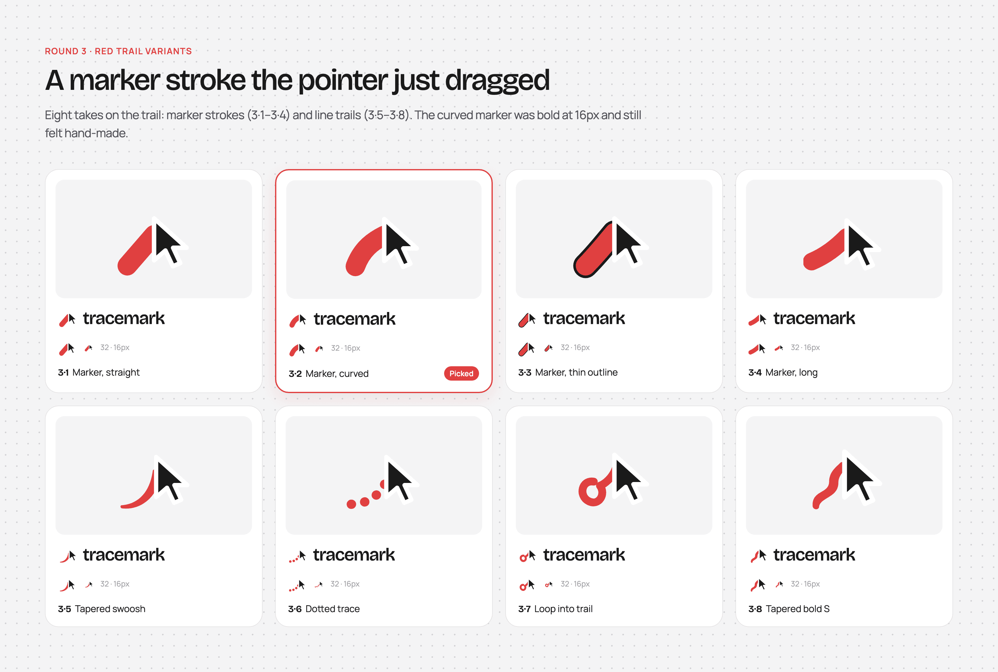
Round 3: From there, I explored different takes on the trail itself, from marker strokes to thinner line trails. The curved marker held up well even at 16px, and it still felt hand-made.
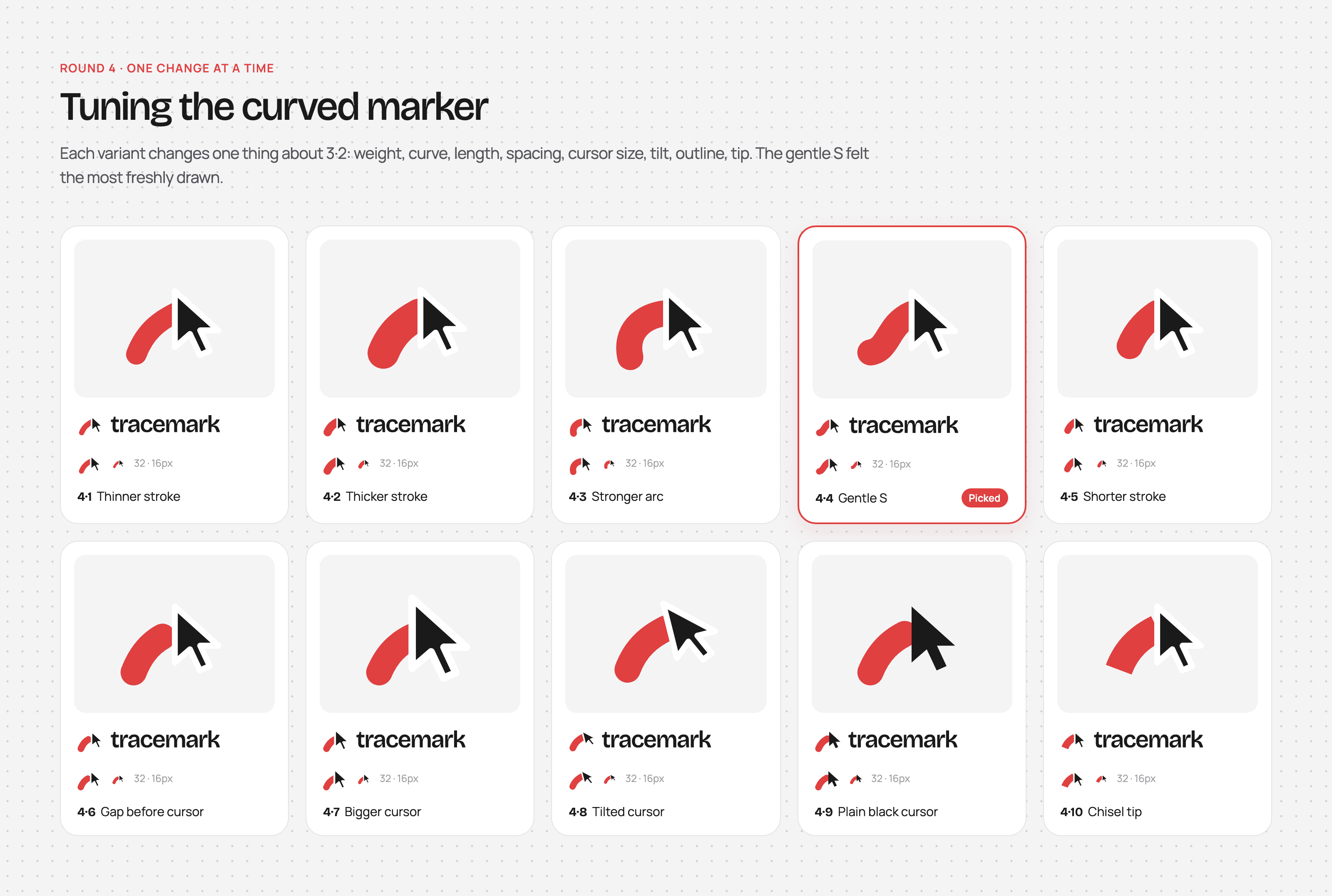
Round 4: Then I tuned the curved marker one change at a time: weight, curve, length, spacing, cursor size, tilt, outline, and tip. The gentle S felt the most freshly drawn.
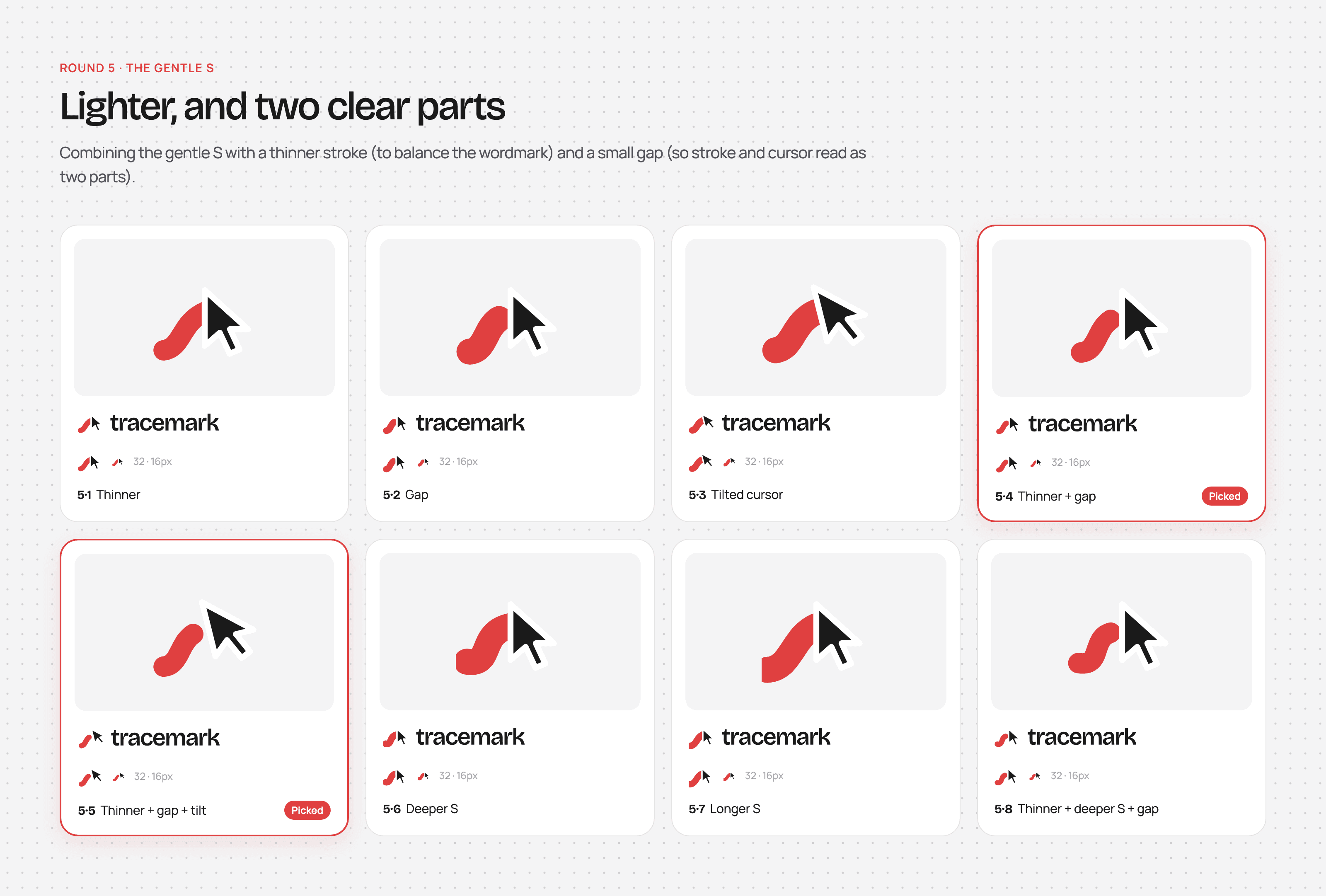
Round 5: A thinner stroke balanced the mark out next to the wordmark, and a small gap made the stroke and the cursor read as two clear parts.
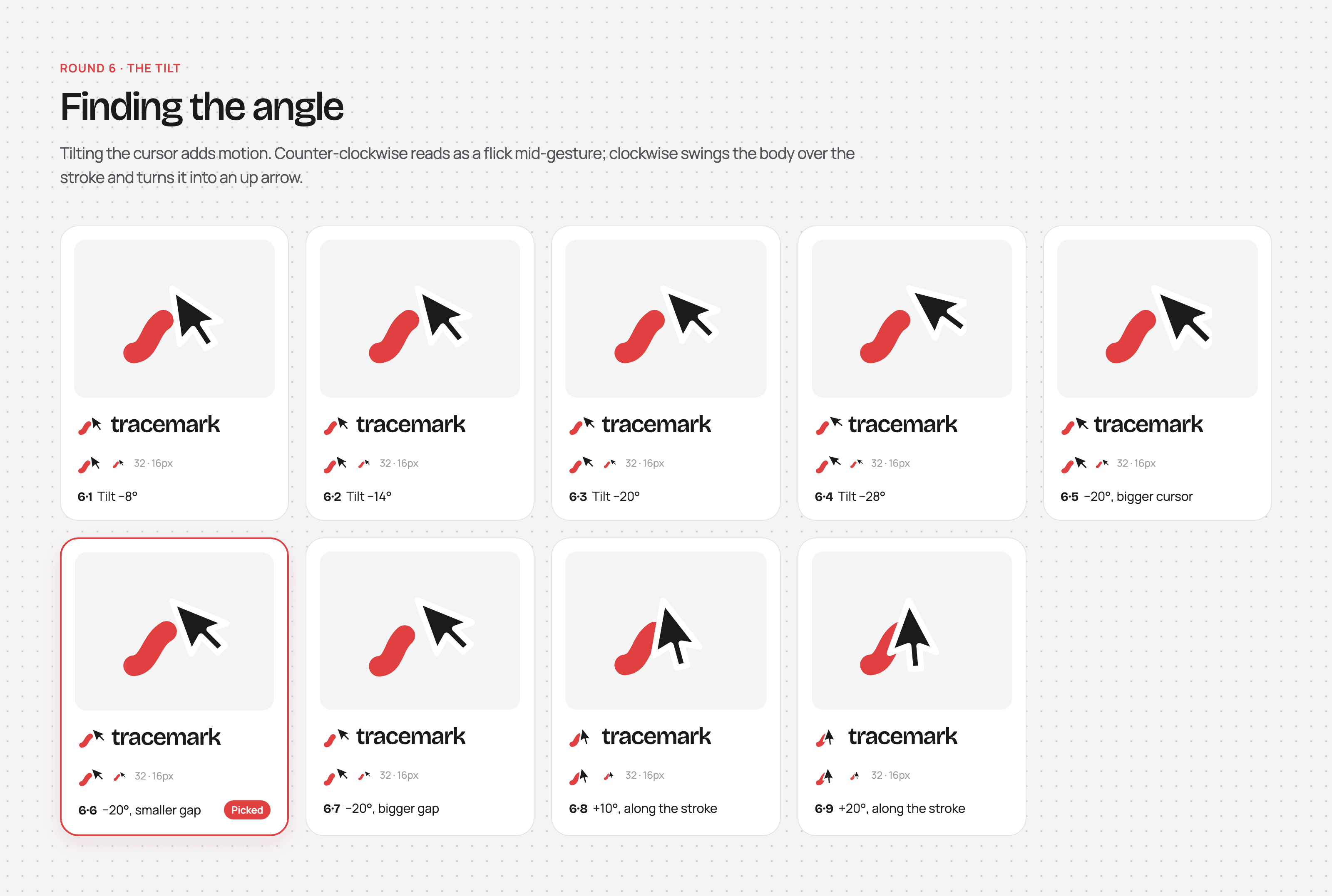
Round 6: Tilting the cursor added a sense of motion. Counter-clockwise read like a flick mid-gesture, so I went with −20°.
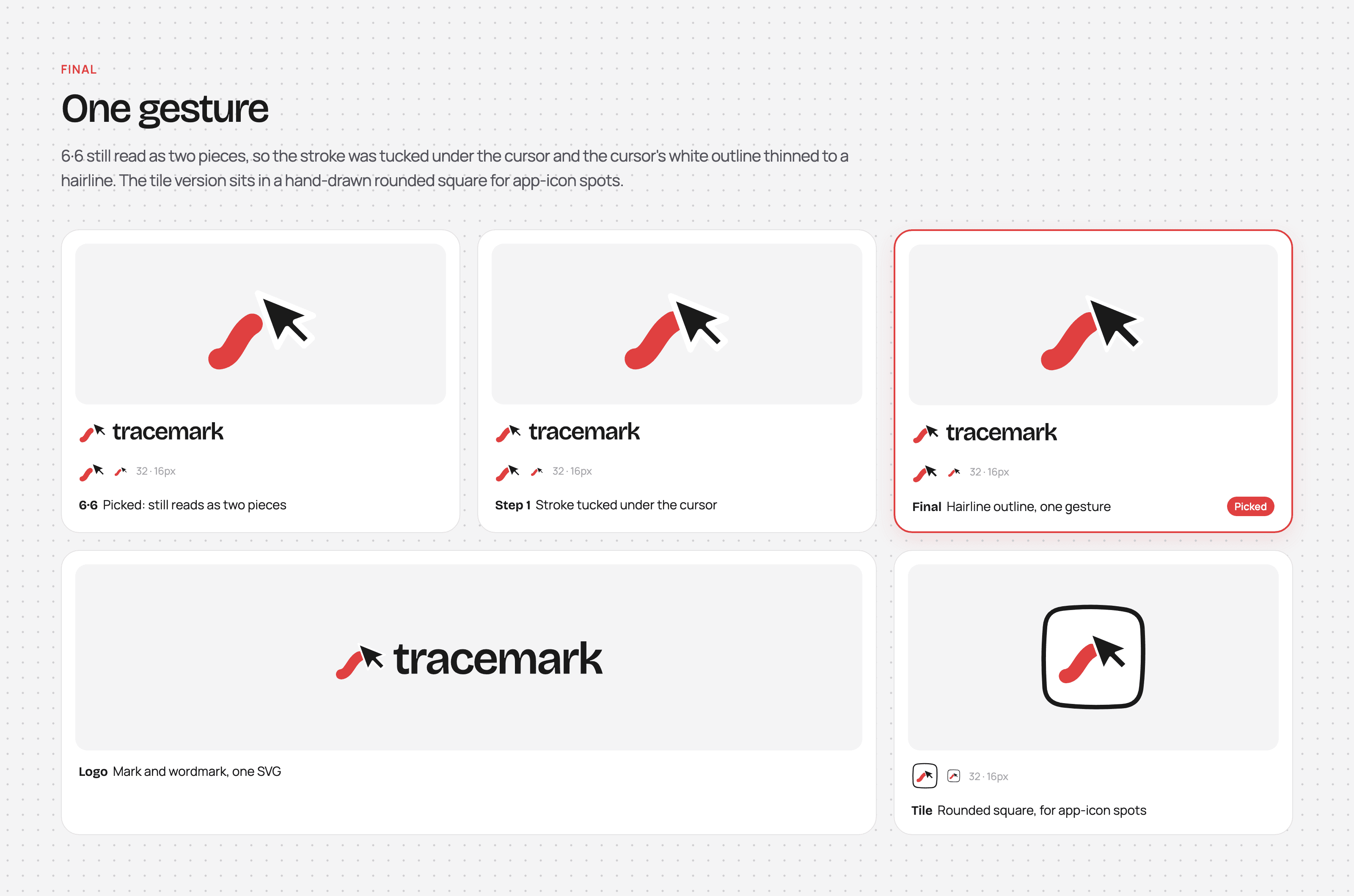
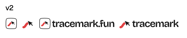
Final: Looking at it again, the gap made it read as two separate pieces rather than one mark. So, I tucked the stroke under the cursor and thinned the cursor's white outline down to a hairline, which finally made it read as one gesture. I also made a tile version that sits in a hand-drawn rounded square for app-icon spots.
Mascots
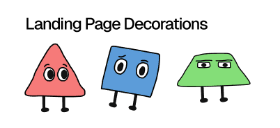
To lean further into the expressive side of the brand, I also drew a few mascots in Figma for the landing page, each one matching one of the brand colors:
The domain
Funnily enough, tracemark.com was taken, so I went with tracemark.fun instead. I guess it all worked out, though, since I eventually wanted playfulness to be part of the established brand anyway.
Outcome
Here is Arman's new flow:
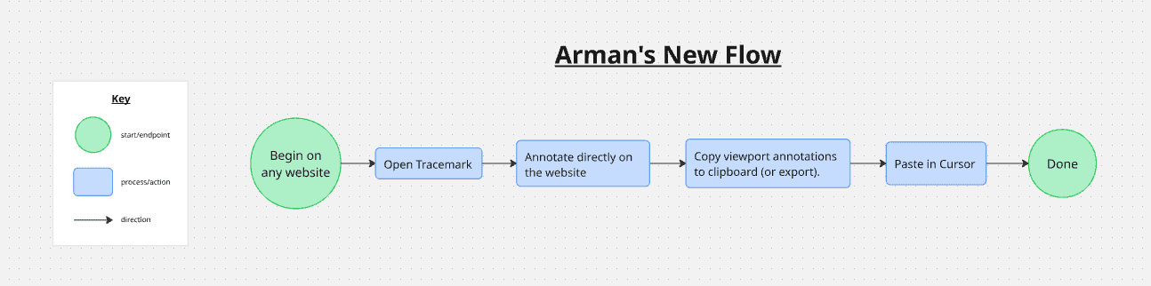
Compared to his old flow, that's 4 steps instead of 6, and he no longer has to bounce between the website, Excalidraw, and Cursor. Everything up until pasting happens directly on the page he's already on. He still uses Tracemark to this day.
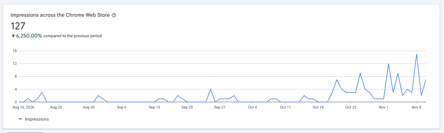
As for everyone else, v1 launched on the Chrome Web Store in early August. I still wanted to get something out there for more feedback, which is why I kept updating the store listing with newer versions of v1 instead of waiting to ship everything at once. Those updates eventually led towards v2, which I also rolled out incrementally, starting with a renamed store listing ("Tracemark – Live Web Markup") in late October and wrapping up with the redesigned toolbar and landing page in early November.
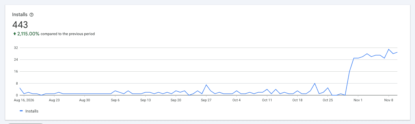
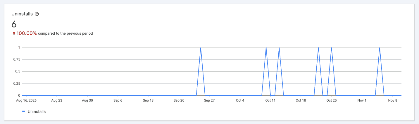
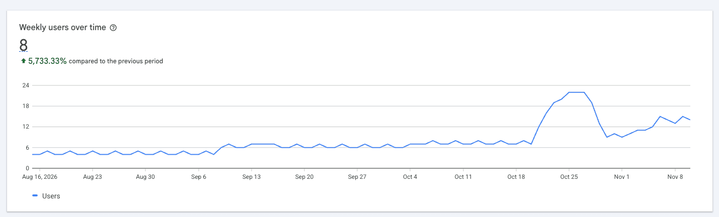
Weekly users sat in the single digits throughout v1, and are now around 15. Total installs are at 443, with daily installs jumping from 1–3 a day to around 25–30 a day once v2 started rolling out. Uninstalls stayed low at 6 total, and reviews went from 2 to 5. I also launched Tracemark on Product Hunt, where it placed #43 out of over 1,000 launches.
One of those reviews from Runbo Li sums up the use case pretty well:
Tracemark is really helpful for quickly communicating changes related to product design. It saves me time from using GPT image to create mock-ups and skips all of the iteration. So I can just indicate exactly what I want the way I want it. It's a useful collaboration tool I recommend for any team that does a lot of design iteration.
Reflection
Establish the foundation first
The biggest thing I'd do differently is establish my ICP, brand identity, core UX, and a structured design system from the very beginning. It would've made the entire process much more structured and a lot less confusing/difficult. For instance, if I had made Figma components for the different tool states, I could've created the toolbar much faster, instead of copy-pasting and manually changing fill colors, icons, etc.
Your users' opinions matter most
At the end of the day, your product is for your users, so their opinion matters the most. Many of the biggest v2 changes, like removing the full-page export and swapping out the pencil logo, came directly from feedback. Getting real user feedback is the most crucial thing you can do to improve a product.
Treating it like an actual product
Taking a few months off ended up being one of the best things for Tracemark. When I came back, I could think of it through an actual product lens, not just another side project I didn't really care about getting real users for. My mentality shifted, and I realized that I had the chance to make this a better product than what was already on the market.
What's next
For now, I think Tracemark is pretty complete. But the code is open source, so anyone is welcome to contribute or fork it and build their own version :)